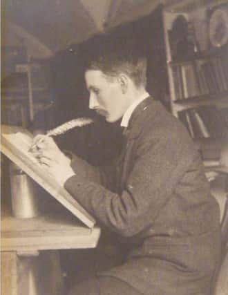
Exhibition marking 100 years since the birth of '˜London's handwriting'
This article contains affiliate links. We may earn a small commission on items purchased through this article, but that does not affect our editorial judgement.


It was while living in the rural village of Ditchling that Johnston created the font, a sans serif alphabet that is known as Johnston Sans, which has now become an icon of metropolitan life.
The exhibition will explore how his design brought the village’s traditions of lettering and craft into the modern era. The exhibition will tell the story of Johnston, his work as a calligrapher, the creation of Johnston Sans, and its legacy as a digital typeface.
Advertisement
Hide AdAdvertisement
Hide AdIt will look at Johnston’s transition from a traditional arts and crafts figure who created unique pieces of hand lettering to a designer of modern sans serif letters for machine production and corporate use. Highlights will include two of Johnston’s original hand drawn designs of the alphabet from 1916, and proofs of the ubiquitous London Underground ‘roundel’, which first appeared on map covers in 1919. Since its introduction the font has only been moderated once, in 1979.
It was in 1913 that Frank Pick, commercial manager for the London Underground Railway, first commissioned Johnston to design this brand new lettering. At the time, many of the station signs and notices were a mixture of serif and sans serif lettering and competed for attention with advertising posters. Pick saw a need for new lettering on the London Underground that had consistency and clarity, envisaging a new font with ‘the bold simplicity of the authentic lettering of the finest periods and yet belonging unmistakeably to the 20th century’.
As was the starting point for all type and lettering designers at the time, Johnston drew the entire alphabet by hand. After being delayed by the outbreak of World War One, the design of the lettering was finished in 1916. Some initial signage was painted by hand according to Johnston’s model, however when wood-letter printing blocks were made in 1917 it became easier and quicker to reproduce the lettering across the ever expanding London Underground.
By 1929 Johnston’s lettering could be seen across London and had become the basis for all architecture, signage and logos of the Underground. The typeface has since become influential upon the visual identity of London as a whole and has been described as ‘London’s handwriting’.
Advertisement
Hide AdAdvertisement
Hide AdThe exhibition launched on Saturday, March 12 and will run until September 11. For more information, visit www.ditchlingmuseumartcraft.org.uk.
Don’t miss out on all the latest breaking news where you live.
Here are four ways you can be sure you’ll be amongst the first to know what’s going on.
1) Make our website your homepage at www.sussexexpress.co.uk/
Advertisement
Hide AdAdvertisement
Hide Ad2) Like our Facebook page at www.facebook.com/pages/Sussex-Express/
3) Follow us on Twitter @sussex_express
4) Register with us by clicking on ‘sign in’ (top right corner). You can then receive our daily newsletter AND add your point of view to stories that you read here.
And do share with your family and friends - so they don’t miss out!
The Sussex Express - always the first with your local news.
Be part of it.